Pagine

‘Frame of Co-existence’ in Chania, Crete

Team: Irgen Salianji, Jonian Silaj, Liana Sofiadi, Orestis Kaklamanis 
Masterplan: Studio JUAJ 
Model: Mike Moritz 
Status: Competition project 
Location: Chania, Crete, Greece 
Program: Daycare, kindergarten, elderly home and neighbourhood park Area: 1.322m2 
Landscaping: 2.520m2


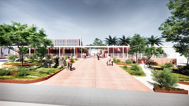
The ‘’framework of coexistence’’ refers to the urbanity and synergy that is created when two or more different programmatic entities are called to socially and spatially synchronize. This is exactly the purpose of our proposal for a modern public building that respects the context on the one hand and on the other makes a statement about how a sensitive public program can be supported by a neighborhood park and vice versa. The physical frame binds the buildings and their courtyards together into a unified cluster while it defines the edge of the park and serves as its porous background. The momentum of the city culminates at the neighborhood park and the building infrastructure comes to enrich this relationship through its materiality, connections and architectural expression.


The two different programs of the building, namely the nursery school and the daycare centre for the elderly, occupy two independent masses but share the same common entrance area which connects them and offers a space for grandparents to meet their grandchildren. The porous frame surrounding the low building complex with courtyards and green areas functions as a ‘’stoa’’ or a canopy: a linear element of public space that symbolizes embrace, security and the fluidity between the public outdoor area of the park and the private indoor environment of the buildings.  The materials used in the construction of the building are inspired by the nature and morphology of the volcanic Cretan soil. Thus, the exposed concrete of the structure contains red pigment and through its ‘’sweet brutalism’’ aims to create a pleasant and playful atmosphere for everyday life. 


The landscape design of the park refers to the Cretan micro-environments where there are no spaces that are the same. Connecting to the urban fabric and adopting to the climate of Amberia, the system of intersecting paths generates green “islands” that seem to float together, always keeping the same distance between them. Thus, the new building looks like it is floating in the green archipelago, creating a dialogue with the park and at the same time keeping the necessary distance from it. The park is independent and becomes a new meeting and reference point for the neighbourhood.


New Sara Hildén Art Museum in Tampere, Finland

Team: Irgen Salianji, Liana Sofiadi
Visualizations: Pavlos Ventouris
Status: Competition project
Location: Tampere, Finland
Program: Museum, public functions and landscaping
Area: 4.965m2

Upon careful study of the city of Tampere, it became obvious the central role that the industrial heritage plays for the identity of the city. As a result the new museum is perceived as an extension of the Finlayson Factory, with its geometry and materiality pre-defined. However, there was a need to add up more qualities and excitement to the project, and relate it more profoundly to the context. The idea was that the new museum should be radically integrated in the context on the basis of its concept, volume and materiality. The ‘radically’ of a grand gesture that affects the urban functionality and the character of the building. The surrounding buildings and the city’s new masterplan that turns Kuninkaankatu Street in one of the main pedestrian and cyclist arteries connecting the central square to Särkänniemi, was taken into account.  


As a result, a diagonal axis was drawn starting on the side of the Finlayson Palace and ending at the intersection of Kuninkaankatu and Finlaysoninkatustreets. This axis splits the museum site in two parts. This diagonal cut achieves firstly the visual connection between the industrial complex and the neo-classical Finlayson Palace, keeping the architectural dialogue on. More importantly, it offers the chanceto rethink the building location. Stepping back from the site’s western edge, the new museum is compactly placed on the east part of the site. The rest is kept free for the park and the city. This profound urban gesture creates visual connections, paths and openness, while it reinforces the project’s urban and architectural identity.


This axis also generates a border, a green zone on the opposite part of the site, where a small-scale ‘neighbourhood plaza’ is created. This square acts as the Western welcoming gate of the whole Finlayson complex. Therefore, the parking entrance and a public space are also neatly and discretely located there, along the existing building. 

One of the main design objectives is the building to refer to its industrial context. The museum acts as the extended end of the Finlayson Factory. Therefore, the closer to the factory, the more solid and massive it gets. On the other side, the openness towards the city and the park influences also the form and materiality of the building. It can be seen as a wooden box, solid on the one end, dissolving slowly towards its other end, when reaching and referring to the openness and the park. There it becomes light and transparent. Similarly the red-brickshell, a reference to the industrial character, dissolves into an intangible glass façade. The glass ending of the building welcomes green and urban views, and the framing of the Finlayson Palace.


Following its form, the programme of the building is divided into public and private. The public part of the programme is placed within the transparent part of the building, the atrium. The aim is to activate the park and the neighbourhood by placing the public functions on the ground floor behind glass. However, some ‘back of house’ functions are also placed strategically in public view. The aim is to set a museum-alarm on for the pedestrians and offer a glimpse of the operational museum functions. 

The moment one enters the museum, the shop, the multifunctional and workshop space, the café, and the info-ticket points are already in sight. A panoramic ramp situated in the atrium, and two elevators, bring the visitor to the entrance point of three levels, where the exhibitions are placed.


There is a vertical ‘back-bone’ on the east side of the museum. It houses the staff and artwork elevators, the (second) escape stairs, the toilets, and a part of the mechanical and electrical installations. Attached to the back-bone are the loading, packing, settling and personnel spaces on the ground floor, the staff workshop, multifunctional and technical spaces on the underground floor, and last but not least, the artwork storage on the highest and safest level.

The exhibition space is the semi-public zone of the programme. Entering and exiting the gallery space is possible for the public only through one gate per floor. It was a conscious decision in order to ensure the access control. However, the routing in the galleries could be set up to be circular, or via a main central space and smaller spaces around it, or any other scenario that could serve efficiently the curator’s intentions. In order to preserve the highest possible levels of flexibility, two loading bearing systems were configured; firstly, a grid of CLT columns that forms a central, grand opening and long narrow spaces on the sides; secondly, a dense grid of timber structural beams on the ceiling, where a secondary bearing system could be mounted on. This combination offers a wide range of possibilities for space unification or fragmentation. There is sufficient storage space within the galleries for these modular units to be stored.


The atrium serves as an aerial exhibition space. Large-scale, contemporary exhibitions could be hung from the 20m-height ceiling and act as an ever changing museum logo. The main functions of packing, settling and loading take place on the ground floor, where there is straight connection via elevators to the exhibition spaces. Each exhibition level could be easily isolated without influencing the function of the museum. Large scale artworks could be inserted into the gallery space through the exterior openings on each level, or as a secondary alternative through the opening glass façade of the atrium.

The main structure of the building is made of wood, in combination with the two concrete cores. It consists of a grid of columns supporting the solid part and cantilevering the column-free atrium. The wood is used as the main construction material, selected to reduce the construction cost. The intention behind this choice was a sustainability and  circularity driven design objective. The wood is a local material, easily purchased, able to be re-used, and environmentally friendly. 

The wood presides over the interior of the museum creating a warm atmosphere. The interior atrium facade unfolds like a wooden ribbon, which provides the interior design with continuity and a vertical aesthetic. The furnishings of the communal spaces are made also by wood. On the contrary, the wooden element in the galleries is limited to the floors and beams. White plasterboard panels supported by a steel framework clad the interior walls. To give the exhibitions a more uniform atmosphere, Barrisol light ceilings are applied between the wooden beams.


Architects for Urbanity propose an urban-rural frame for Zbraslav Square in Prague

Zbraslav square is too big and undefined in its current condition. It needs the introduction of a human scale and a better definition of its main square, while a set of activities and green pockets may unfold and wrap around it. The new condition offers a strong identity and functional solution that can engage the local residents and provide them with a feeling of belonging. The square fulfils the expectation for an urban and metropolitan layout that can accommodate large events, while at the same time it responds to the local character of Zbraslav and adds to its historic and austere character.

Team: Irgen Salianji, Andreas Anagnostopoulos, Stavria Psomiadi
Status: Competition project
Location: Zbraslav, Prague, Czechia
Program: Public space, public transport and landscaping
Area: 13.821m2

The current layout of the square is dominated by the crossroad and the four fragmented green areas that lack quality and iden­tity. The size of the square is disproportional to the height of the surrounding facades resulting in an unwelcoming space that lacks functionality and beauty. The existing landscape is poorly designed and maintained, while numerous barriers and obsta­cles interrupt the flow and reduce accessibility. We propose the elimination of the crossroad and the merge of the four triangular pockets of landscape into a 40x40 meters square that is open, accessible and proportional to the human scale of Zbraslav. The central square is empty and paved to allow for events and gatherings, while the space around it be­comes available for landscaping, urban activities and the traffic solution.

The square is surrounded by a light steel structure that frames it, while the WWI statue is relocated to the prominent centre of the western edge of the square. The traffic solution is efficiently developed around the square and includes two-directional roads for the buses and automobiles. The diagonal connection is des­ignated for pedestrian access but can be also used by lorries and trucks that service the events in the square. Between the square and the roads we develop a series of dif­ferent pockets that host activities areas, sports and recreational functions. The northern edge of the square meets the info cen­ter, public sanitary facilities and the bus stops. Designated pock­ets of activities can be used by the cafeterias and restaurants that are facing the square or can be rented out to third parties for special events and happenings.


The areas between the activities pockets are landscaped with different types of greenery and vegetation. Diversity and dif­ferentiation in the chosen types of soil and shrubs enhance the aesthetic presence of the organic pattern by creating an urban biodiversity and resilience at the same time. The aim is to have a low maintenance landscape that has a strong character and fits to the climate of Zbraslav and its vivid nature. The large pine trees located on the north-eastern corner of the square are preserved while most of the other existing trees are relocated within the square to allow for the new concept and to highlight it. Few new trees such as pine and platanus trees are proposed to provide shading to the activities pockets and further frame the open square.


The material of the central square is antislip recycled terrazzo for outdoor use with an anti-glare coating and over-scaled texture that provides domesticity to the public space. A floor-mounted water fountains installation is envisioned for the south-eastern corner of the square to provide cooling during the summer days and generate playful moments for children. The edges of the central square are characterized by the radical change of material and therefore create a clear distinction be­tween the urban and the landscaped zones of the proposal. The activities pockets are separated by metal edging and are cov­ered in natural materials such as soil, gravel, crushed limestone, wood chips etc.


The WWII statue is fully restored and slightly relocated to the centre of the western edge of the square, while the steel struc­ture that frames the square is bent around it to make it part of the public space. The continuity of the pattern on the landscaped areas is se­cured by the diversity of natural materials, while the pockets are equipped with standard and special urban furniture that allow for informal daily use and special events. Fixed benches and movable chairs provide sitting options while modular objects provide with flexibility and stimulate creative the use of the pub­lic space.


The bus station obtains a special character with the use of viv­id paint colours on its steel frame, making it clearly visible and iconographic. A linear steel bench throughout the whole length of the station provides for sitting, while the pavement on which it stands is a combination of water permeable cobblestone and limestone. The streets, parking spots and sidewalks are paved with wa­ter permeable cobblestones in a variety of tones that allow for the design pattern to be readable while making the distinction between street and sidewalks without employing obstacles or extra signage.